Out of the box, io.Connect Browser ships with a dark theme and a light theme. Users can switch between them, and you can control themes programmatically. But your brand and use cases are unique. Stakeholders and users have expectations - they want the platform to fit their needs, feel modern and match your company’s identity. So, a UX designer is already sketching out exactly how that should look. You will need to implement it in the end, so it’s useful to know what’s possible, what’s tricky and what’s to be avoided.
Fortunately, interop.io gives you a visual kit that is flexible enough to work for any user profile with any set of applications.
io.Connect Browser Look and Feel Overview
An io.Connect Browser project consists of a Main app and multiple Browser Client apps. The Main app serves as a hub, facilitating communication between all client apps.

io.Connect ships with a complete set of UI components that cover the common needs of multi-app platforms, and they work the same way across browsers and other supported containers. The defaults are production-ready, but everything is designed to be extended or replaced: themes, panels, system UI, and even the core components like Workspaces, Launchpad, Modals, and Notifications. If a built-in component doesn’t fit your requirements, you can override its styling or swap in your own implementation without breaking the underlying platform behavior.
Here’s what you’re working with:
Configurable Experiences
Sign-In Screen
Permissions Flow
Core Panels
Workspaces App
Launchpad Panel
Notification Center
Extensible Components
Modals & Dialogs
Widget
Styling & Branding
Applications & Themes
Platform styles & CSS
App-Level UI
Theme subscription
Per-app styles
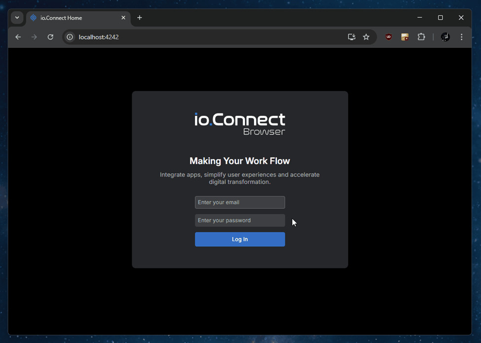
Login Screen
Let’s start with the sign-in screen. The login screen is configurable and customizable using login.components – more here io.Connect Browser Documentation - Home App > Library Features . You’ve got options here. You can use the optional built-in screen. You can partially replace it by updating the logo and heading. Or, for a fully custom login experience, you can redirect users to an external provider like Auth0 or Azure AD, then return them back to the Home App once authenticated.
View documentation: io.Connect Browser Documentation - Home App > Library Features
Permissions/Setup Flow
The Setup Flow handles browser permissions and guides first-time user setup. It’s configurable via setupFlow and built as a React component.
This flow is required for correct platform behavior. It ensures the platform can manage windows and notifications correctly. For security reasons, browsers don’t allow you to skip or automate this, it has to be triggered by user interaction.
You can style the flow slightly, adding a custom logo, changing colors, etc, but the functionality itself is essential and shouldn’t be bypassed.

View documentation: io.Connect Browser Documentation - Home App > Library Features
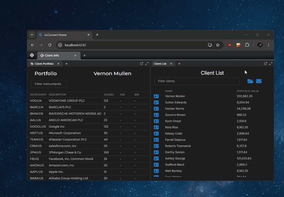
Workspaces App
The Workspaces App is the core layout container. It gives users a tabbed workspace layout, managing apps and window positions. This is your main platform app. Users can open multiple tabs, each holding rows, columns, groups, and individual app windows. The layout is fully configurable and customizable. Apps can be dynamically injected, and layouts can be saved and restored.
This is one of the most customizable pieces of io.Connect Browser. Clients often build their entire platform experience inside this app because of its flexibility and extensibility.

View documentation: io.Connect Browser Documentation - Windows > Workspaces > Workspaces App
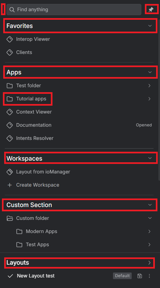
Launchpad
The Launchpad is the sidebar where users access their most important tools. It handles favorites, workspaces, applications, and layouts. Search functionality is built in. Sections are collapsible. And it can be hidden entirely if needed.
Configuration happens via launchpad.components.sections. You get built-in sections for Favorites, Apps, and Workspaces.
You can fully configure its content using a sections array. Reuse the built-in components like <FavoritesSection />, <WorkspacesSection />, or provide your own <Section />. Items support context menus, tooltips, and counters.
You can also extend it with custom components. A branded research folder, a dynamic client section, or whatever fits your platform.
View documentation: io.Connect Browser Documentation - Home App > Library Features
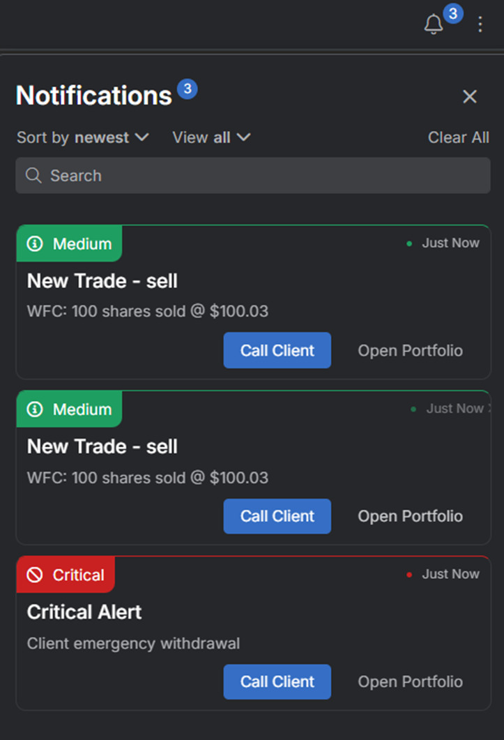
Notifications Panel
The Notifications Panel collects alerts from all apps and services across the platform. It shows a unified history of recent alerts. Users can review unread messages, click into details, and navigate to the source app or item. Notifications have state like: “Acknowledged”, “Active”, “Closed”, “Seen”, etc.
Everything connects via the Notifications API. You can fully style or replace the panel, or build your own stream-based UI. You can create action buttons for the notification. When the user clicks on an action button, specified callbacks will be invoked.
View documentation: io.Connect Browser Documentation - Notifications > Setup
Modals and Alerts
Modals show alerts and dialogs - confirmations, input prompts, and warnings. Any app can trigger them via the Modals API.
Build and control them from @interopio/modals-api and make sure you enable alerts and dialogs in your browser config.

Modals and alerts are absolutely flexible. You can create, style, and update them however you need.

View documentation: https://docs.interop.io/browser/windows/modals/setup/index.html
Widget
The Widget is a floating UI for channel switching and reattach functionality. It auto-shows on popped-out windows and is optional inside Workspaces.
Enable it via the Main App widget config. It requires the bundle, styles, and fonts. Apps opt in with widget: { enable: true }.
View documentation: io.Connect Browser Documentation - Widget
Apps and themes
Your applications are responsible for updating their own styling when the theme changes. That means two simple steps are needed:
A. On startup, grab the currently selected theme using the getCurrent() method of the Themes API.
B. Subscribe for theme changes using the onChanged() method of the Themes API.
Persisting the Selected Theme
The selected theme is automatically persisted between io.Connect Browser restarts. It’s saved in the browser’s local storage - no extra work required.
Styling with CSS
Platform styles
Starting in io.Connect Browser 4.0, the platform introduced a unified Platform Styles system. This makes customization really straightforward.
- Platform Styles expose component-level CSS variables for the built-in system UI.
- Overriding a variable changes only the design, not behavior.
- Your overrides survive Workspaces/UI upgrades, because variables remain stable even when HTMLchanges without relying on internal DOM structures or class names.
Each major UI area now ships with its own CSS variable namespace, and you can override these variables from your own stylesheet.
- Workspaces App
- Launchpad
- Modals
- Home App screens (login, setup flow, permissions)
- Notifications
- General platform layout and color tokens
You simply import the default UI CSS and then override variables in your own stylesheet:
:root {
  --io-workspaces-tab-bg: #1e1e1e;
  --io-launchpad-panel-background: #101010;
  --io-modal-header-color: var(--brand-primary);
}
Because these variables are applied at the component level, you don’t need to know the internal structure of Launchpad, Modals, or Workspaces - the platform handles it.
The docs provide a variable table for each area under: io.Connect Browser Documentation - Platform Styles
The styling strategy is straightforward:
- Apply global styles via theme tokens. No need to rebuild apps to restyle them.
- Customize per-component appearance (login, modals, panels, widgets)
- Customize each app’s styling locally while keeping the platform’s global theme and behaviors intact
- Align UX across web and desktop containers
Congrats on reaching the end - that was a long article. Customizing the io.Connect Browser UI comes down to understanding which parts of the platform are fixed (because browsers require them) and which parts you can shape to fit your product. Themes, CSS variables, and component overrides cover most styling needs. The Home App gives you clear extension points for login, setup flow, Launchpad, system panels, and the Workspaces header. Notifications, Modals, and the Widget all have dedicated APIs that let you adjust behavior or replace the UI entirely.
If you’ve hit edge cases or interesting patterns with io.Connect Browser, please share your thoughts below. It helps others understand real-world implementations, and we can improve the docs based on those examples.